How to Get the Kodachrome Look in Lightroom (Kodachrome 64)
A practical guide to the Kodachrome look in Lightroom: the film's story, what defines its colours, a manual recipe and what a Kodachrome 64 preset pack adds.
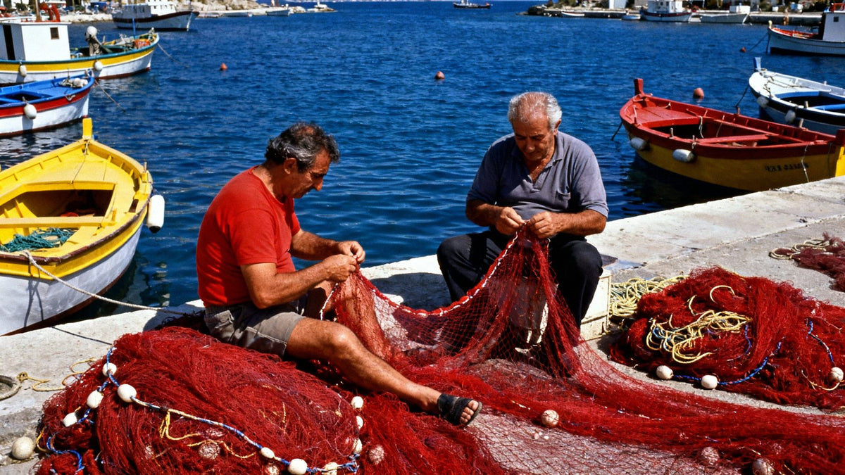
To get a Kodachrome look in Lightroom, build contrast like a projected slide: firm, deep blacks, a gentle S-curve and clean highlights. Then push reds and yellows toward dense, slightly warm saturation, keep blues deep and a touch cyan, and finish with very fine grain. The rest of this guide explains each step, the mistakes to avoid and when a finished Kodachrome preset saves you the trouble.

A short history of Kodachrome
Kodak introduced Kodachrome in 1935, and it went on to become one of the most recognisable colour films ever made. It was a reversal (slide) film: you got back a positive transparency to project or print from, not a negative. Unlike most colour films, Kodachrome carried no colour couplers in its emulsion. The dyes were added during development, in a demanding process that from the mid-1970s onward was known as K-14. That complexity is a big part of the story. Only specialised labs could develop it, and as demand fell, so did the number of labs.
Kodachrome 64, launched in the 1970s, became the version most photographers remember. For decades it gave mid-century magazines, National Geographic-style travel reportage and countless family slide shows their colour. Kodak announced the end of production in 2009. Dwayne's Photo in Parsons, Kansas, the last lab running K-14, processed its final rolls at the end of 2010. Since then the look has only existed in archives, in projected slides and in digital recreations.
What defines the Kodachrome colours
Kodachrome is easy to recognise but surprisingly hard to pin down. Four traits do most of the work:
- Dense, saturated reds and yellows. Reds look rich rather than neon, with a little weight and warmth. Yellows lean golden and stay solid instead of turning lemony.
- Deep blacks. Shadows fall off quickly into dense, inky darks. This is slide film: there is little latitude to lift them, and that density gives the colour its depth.
- Distinctive blues. Skies and water are deep and clean, often slightly cyan-leaning, and never washed out. They are a cool counterweight to the warm reds.
- Projected-slide contrast. Midtones have snap, highlights are bright but not clipped and harsh, and the whole frame has the glow of light passing through a transparency.
Skin tones tend to be warm and a little ruddy, which is one reason Kodachrome feels so human in street and travel work. Grain at ISO 64 was very fine, so the look is about colour and density, not texture.
The manual Kodachrome recipe in Lightroom
These settings are starting ranges, not fixed numbers. A harbour at noon and a market at dusk need different amounts. Work on a RAW file if you can, and adjust in the order below so each step builds on the last.
1. Basic panel: set the slide-film foundation
- Temp/Tint: neutral to very slightly warm. Around +2 to +5 on Temp from your as-shot balance is plenty. Kodachrome was a daylight film, not a filter.
- Exposure: slightly darker than you would normally go, around -0.1 to -0.3. Slide shooters exposed for the highlights, and the colour gets richer with a little restraint.
- Contrast: around +10 to +20.
- Highlights: around -20 to -40, to keep skies and bright walls holding colour.
- Shadows: 0 to -10. Resist the urge to open them.
- Blacks: around -10 to -25 for real density.
- Clarity: 0 to +10 at most. Vibrance: around +5 to +15. Saturation: leave near 0 and do the colour work in HSL instead.
2. Tone Curve: strong blacks, controlled highlights
Use the point curve. Pull the shadow quarter down a little (for example, input 25 to output around 18–22), and lift the three-quarter tones slightly (input 75 to around 78–80). Leave the black point at zero. Unlike faded film looks, Kodachrome does not have lifted, milky blacks. If highlights feel harsh, pull the white point down a few values. The result should be a confident S-curve that makes the frame feel projected rather than printed.
3. Color Mixer (HSL): reds, yellows and blues
- Red: Hue 0 to +5, Saturation +5 to +15, Luminance -5 to -15. Darkening reds slightly is what makes them feel dense rather than loud.
- Orange: Hue 0 to -5, Saturation 0 to +5. Keep skin under control. Too much here turns faces orange.
- Yellow: Hue -5 to -15 (toward gold), Saturation +5 to +15, Luminance -5 to -10.
- Green: Hue +5 to +15 (away from yellow), Saturation -5 to -15. Kodachrome greens were deep and a little cool, never acidic.
- Aqua: Saturation 0 to +10.
- Blue: Hue -5 to -10 (slightly toward cyan), Saturation +5 to +15, Luminance -10 to -20 for that deep sky.
4. Color Grading: a subtle split
Keep this gentle. Shadows: a cool blue-cyan around hue 200–220 at saturation 5–10. Highlights: warm, around hue 40–55 at saturation 5–10. Leave the Midtones empty or add the faintest warmth. Set Blending around 50–70 and nudge Balance slightly toward the highlights if the shadows feel too cold. The goal is separation between warm subjects and cool depth, not a visible tint.
5. Calibration: where the character lives
Calibration changes how Lightroom interprets colour at the source, and small moves here often matter more than big HSL moves.
- Red Primary: Hue 0 to +10, Saturation +5 to +15. This warms skin and makes reds feel richer.
- Green Primary: Hue -5 to -15, Saturation 0 to +10. This adds depth to the palette as a whole.
- Blue Primary: Hue -5 to -15, Saturation +10 to +25. This is the classic film-emulation move. It enriches colour across the image and helps the blues read as Kodachrome rather than digital.
6. Effects: very fine grain
Grain Amount around 10–20, Size around 15–25, Roughness around 40–50. It should be barely visible at full screen and felt more than seen. Skip the vignette, or keep it very light. Too much darkening at the corners pushes the image toward a toy-camera look.


Common mistakes
- Using global Saturation. It makes greens and skin loud along with the reds. Kodachrome saturation is selective. Do it in HSL and Calibration.
- Lifting the blacks. A matte, faded curve belongs to instant film or expired stock. Kodachrome's blacks are dense.
- Bright, neon reds. Raising red luminance makes reds glow digitally. Lower it a touch instead.
- Too much warmth. A strong yellow-orange cast reads as "vintage filter," not slide film. Keep the white balance close to neutral and let the colours carry the warmth.
- Heavy grain. ISO 64 film was very fine-grained. Coarse grain contradicts the look.
- Ignoring the light. Kodachrome shines in clear daylight with strong colour. In flat overcast light, add a little more contrast and accept a quieter result.
Kodachrome 64 vs Ektachrome E100 vs Ektar 100
These three are often confused because all are fine-grained, saturated Kodak looks. They behave very differently, though.
| Kodachrome 64 | Ektachrome E100 | Ektar 100 | |
|---|---|---|---|
| Film type | Slide (reversal), K-14 process | Slide (reversal), E-6 process | Colour negative, C-41 process |
| Overall palette | Warm, dense reds and yellows, deep blues | Clean, cool whites, vivid controlled blues and cyans | Punchy, high saturation, luminous skies |
| Blacks and contrast | Deep, inky blacks, projected-slide contrast | Crisp micro-contrast, clean neutrals | Precise contrast with more shadow latitude |
| Grain | Very fine | Very fine | Extremely fine |
| Best for | Travel, street, documentary | Travel, editorial, product | Landscape, nature, architecture |
In short, choose Kodachrome for warmth and nostalgia, Ektachrome E100 for a cleaner, cooler modern slide look, and Ektar 100 when you want maximum punch with negative-film latitude.

What the HelloPresets Kodachrome 64 pack adds
The manual recipe above will get you close on a single image. Where it gets harder is consistency across a whole set: harbour scenes in hard sun, interiors under mixed light and portraits in open shade each need different tuning. That is what our Kodachrome 64 film presets are built for. It is our largest pack, with 20 tested variations instead of the usual 10:
- Standard 1–8: the core Kodachrome rendering, tuned for different light and contrast levels.
- Blue 1–2 and Blue Fade: cooler versions that emphasise skies and water, with one softer, faded option.
- Contrast: for flat light that needs the projected-slide punch.
- Fade and Warm Fade: gentler blacks for a softer, archival feel.
- Neutral 1–2: restrained colour for mixed or tricky white balance.
- Purple 1–2: violet-leaning interpretations for dusk and evening scenes.
- Warm 1–2: golden-hour warmth for skin and late light.
Every pack includes .xmp files for Lightroom Classic, Lightroom desktop and Photoshop Camera Raw, .dng files for the free Lightroom mobile app, and .costyle files for Capture One. A single film is $19 (€19), paid once, with an instant download and the files saved in your account. Commercial and client work is allowed. If you also want Portra 400, Ektar 100, Ektachrome E100 and UltraMax 400, the Kodak Bundle includes all five stocks for $49 (€49). For setup help, see our installation guide. For the warmer negative-film side of Kodak, read how to get the Portra 400 look.
HelloPresets is an independent studio and is not affiliated with Kodak. Our presets are simulations inspired by the look of the film, and the name is used only to describe that look.
FAQ
Can you still shoot real Kodachrome?
No. Kodak stopped production in 2009, and the last K-14 processing at Dwayne's Photo ended in 2010. Leftover rolls can no longer be developed in colour, so today the look only exists through digital recreation.
What is the best Kodachrome preset for Lightroom?
Look for a preset that gets the reds, blacks and blues right without heavy global saturation, and that comes in several variations for different light. Our Kodachrome 64 pack has 20 for that reason.
Does the Kodachrome look work on JPEGs and phone photos?
Yes, but RAW files give you more room in the highlights and in the Calibration panel. On JPEGs, use lighter settings, especially on the Blacks and the curve.
What is the difference between Kodachrome and Ektachrome?
Both are slide films. Kodachrome is warmer, with dense reds and deep blacks. Ektachrome E100 is cleaner and cooler, with neutral whites and crisp blues.
Do Kodachrome presets work in Lightroom mobile?
Yes. The .dng versions import into the free Lightroom mobile app on iPhone, iPad and Android. Desktop users use the .xmp files instead.