How to Get the Portra 400 Look in Lightroom (Step by Step)
A complete manual recipe for the Portra 400 look in Lightroom: warm natural skin, soft contrast, creamy highlights and fine grain, plus common mistakes and film comparisons.
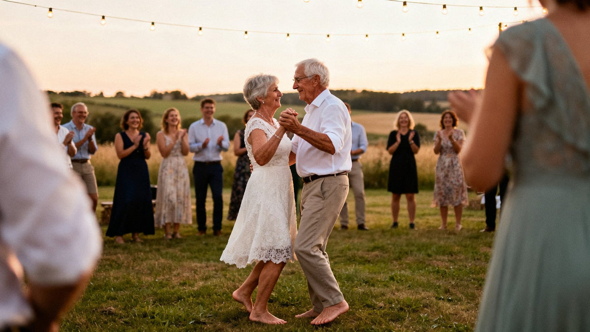
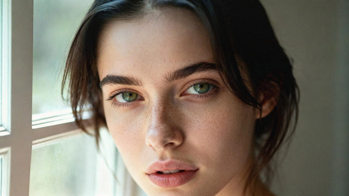
To get the Portra 400 look in Lightroom, warm the white balance slightly, soften contrast with a gentle S-curve that lifts the blacks and rolls off the highlights, pull orange saturation down a touch so skin stays natural, nudge greens toward yellow and soften blues, then add fine grain. The goal is not a heavy filter but a quiet, flattering rendering: warm, honest skin, creamy pastel highlights and colour that never shouts.
Below is a complete manual recipe you can build from scratch, the mistakes that most often ruin it, and how Portra 400 compares with other popular film looks.

What makes Portra 400 look the way it does
Kodak Portra 400 is an ISO 400 colour negative film, developed in standard C-41 chemistry. The Portra line was designed for professional portrait and wedding work, and the current Portra 400 has been in production since 2010. Its look comes from a handful of traits that work together.
Skin tones first
Portra was built around skin. Reds and oranges are rendered warm but restrained, so faces look healthy without turning orange or ruddy. Different skin tones in the same frame hold together well, which is exactly why portrait and wedding photographers relied on it.
Forgiving latitude
Colour negative film tolerates overexposure remarkably well, and Portra is famous for it. Many photographers deliberately rated it at ISO 200 or lower to get brighter, airier negatives. That habit is part of the look people now associate with Portra: open shadows, soft light, nothing clipped.
Pastel highlights and gentle contrast
Highlights roll off smoothly into a creamy, slightly warm white instead of hitting a hard edge. Overall contrast is moderate, and saturation sits just below what digital cameras produce by default. The result reads as natural rather than flat.
Fine grain
For a 400-speed film, Portra's grain is fine and tight. Scanned from 35mm it is visible but polite; from medium format it nearly disappears. That matters when you recreate it: the grain should be a texture, not a statement.
The Portra 400 Lightroom settings, step by step
These are starting ranges, not fixed values. Results depend heavily on your camera, your light and your exposure, so adjust by eye. Work on a well-exposed RAW file, ideally a portrait in soft daylight, and keep the camera profile on Adobe Color or Adobe Standard to begin.
1. Exposure and white balance
- Exposure: brighten slightly, around +0.2 to +0.5. Portra images tend to sit on the bright side, echoing that overexposed-negative habit.
- Temp: warm by around +200 to +500K from your neutral point (or +5 to +10 on a JPEG scale). You want a warm undertone, not a sunset.
- Tint: a small push toward magenta, around +3 to +8, counteracts the green cast digital sensors can give foliage and skin.
2. Basic panel
- Contrast: around -10 to -20. Portra is soft, but you will add shape back with the curve.
- Highlights: around -20 to -40 to recover detail and start that gentle roll-off.
- Shadows: around +10 to +25 to open faces and dark clothing.
- Whites: around -5 to -15 so pure white never quite clips.
- Blacks: leave near 0; the tone curve will handle the lift.
- Clarity: around -5 to -10 for portraits. Negative clarity softens skin in a way that feels optical rather than retouched. Leave Texture at 0 or slightly negative.
- Vibrance and Saturation: Vibrance around -5 to +5, Saturation around -5 to -15. Portra colour is rich in skin and muted elsewhere.
3. Tone curve: lifted blacks, rolled highlights
Open the point curve. Drag the bottom-left point straight up to around 10–20 on the output scale (out of 255) so pure black becomes a soft charcoal. Add a point in the shadows around input 64 and pull it slightly down to keep some depth. Add a point in the highlights around input 192 and push it slightly up, then pull the top-right point down to around 240–248. This makes a soft S-curve with a matte toe and a creamy shoulder. Keep the lift subtle: Portra is soft, not washed out.
Optionally, in the Red channel, lift the shadows very slightly and in the Blue channel lower the highlights a touch. That warms highlights the way negative film does.
4. Color Mixer (HSL)
- Red: Hue around +3 to +8, Saturation around -5 to -10. Keeps lips and cheeks from going crimson.
- Orange: Hue around -2 to +5, Saturation around -5 to -15, Luminance around +5 to +10. This is the skin channel: slightly desaturated and brightened for that clean, glowing Portra skin.
- Yellow: Hue around -5 to -15, Saturation around -10 to -20. Pulls yellows toward warm gold.
- Green: Hue around -15 to -30 (toward yellow), Saturation around -15 to -30. Portra greens are olive and soft, never neon.
- Aqua and Blue: Blue Hue around -5 to -15 (toward cyan), Saturation around -10 to -20, Luminance around +5 to +10. Skies become pale and powdery.
5. Color Grading
- Shadows: a cool teal-blue, hue around 200–220, saturation around 5–10.
- Highlights: warm peach, hue around 40–55, saturation around 5–12.
- Midtones: leave neutral, or add a whisper of warmth (hue around 35, saturation 2–5).
- Blending: around 60–80 for smooth transitions; Balance: slightly positive if you want the warmth to dominate.
The split between cool shadows and warm highlights is subtle on real Portra scans, so keep these numbers low.
6. Calibration
- Red Primary: Hue around +5 to +15, Saturation around -5 to 0. Moves skin away from pink.
- Green Primary: Hue around +5 to +15, Saturation around -5 to -10. Helps foliage and skin share a warmer base.
- Blue Primary: Hue around -5 to -15, Saturation around +5 to +15. Counterintuitively, this often makes the whole image feel richer and warmer, a familiar trick in film emulation.
7. Grain
In Effects, set Grain Amount around 10–20, Size around 15–25, Roughness around 40–55. View at 100% and check it looks like texture rather than noise. For a medium-format feel, go even lower.


Common mistakes with the Kodak Portra look
Orange skin
The most common failure. Warming the white balance and boosting orange saturation at the same time quickly turns faces into fake tan. Warm with Temp, then pull Orange saturation down and lift Orange luminance. Check skin against something you know is neutral, like a white shirt.
Too much fade
A heavily lifted black point reads as "vintage filter", not Portra. Real Portra scans have soft blacks, but they still have blacks. If the darkest part of your image looks grey and cloudy, bring the curve's black point back down.
Too much grain
Portra 400 is a fine-grained film. Heavy, coarse grain belongs to pushed films or stocks like HP5. Keep grain low, and remember it looks stronger on a phone screen after export compression.
Ignoring the light
One recipe will not suit golden hour, open shade and indoor tungsten equally. Golden-hour frames need less added warmth; shade needs more. Adjust Temp first before touching anything else.
When to use Portra 400 vs other films
Portra 400 is the safe, flattering choice for people. But it is not the only answer, and choosing the right stock for the scene matters more than any slider.
| Film look | Colour character | Contrast and grain | Best for |
|---|---|---|---|
| Portra 400 | Warm, natural skin, pastel highlights, soft greens | Soft contrast, fine grain | Portraits, weddings, lifestyle |
| Fuji 200 | Cooler, rich greens and blues, greenish shadows | Moderate contrast, fine to medium grain | Outdoor portraits, greenery, everyday |
| Ektar 100 | Punchy saturation, luminous blue skies | Precise contrast, finest grain | Landscape, nature, architecture |
| UltraMax 400 | Warm, lively consumer colour, punchy yellows and reds | Medium contrast, honest medium grain | Family, travel, snapshots |
In short: choose Portra when skin is the subject, Fuji 200 when you want a cooler, greener mood, Ektar 100 when the landscape is the star, and UltraMax 400 for a warmer, more nostalgic everyday feel. Our guide to the best film presets for Lightroom covers the rest of the range.

What a Portra 400 preset pack adds
The manual recipe above will get you close, and building it yourself is the best way to understand the look. Where a finished preset helps is consistency and range. A single set of numbers rarely survives a full wedding day, moving from bright sun to shade to a dim reception.
The HelloPresets Portra 400 pack includes 10 variations tested on different light and skin tones: Standard 1 to 5 as graduated starting points, plus Contrast, Cool, Fade, Green and Warm for specific situations. Each comes as .xmp for Lightroom Classic, Lightroom desktop and Photoshop Camera Raw, .dng for the free Lightroom mobile app, and .costyle for Capture One, so a set edited on desktop and finished on a phone still matches. It is a one-time purchase at $19 (€19), and you can use it for client work.
If you shoot across different stocks, the Kodak Bundle ($49 / €49) combines Portra 400 with Kodachrome 64, Ektar 100, Ektachrome E100 and UltraMax 400. New to presets? See how to install presets in Lightroom, Photoshop and Capture One.
A quick note: HelloPresets is an independent studio and is not affiliated with Kodak. Our presets are simulations inspired by the look of the film, and the name is used only to describe that look.
FAQ
What are the best Lightroom settings for a Portra 400 look?
Start with slightly warm Temp, a touch of magenta Tint, Contrast around -10 to -20, a soft S-curve with lifted blacks, reduced Orange and Green saturation, greens shifted toward yellow, and Grain around 10–20. Fine-tune by eye for each photo.
Can I get the Portra 400 look in the Lightroom mobile app?
Yes. Every control in the recipe, including the tone curve, Color Mixer, Color Grading, Calibration and Grain, is available in Lightroom mobile. Presets in .dng format can be imported into the free app.
Why does my Portra edit make skin look orange?
Usually too much warmth combined with too much Orange saturation. Reduce Orange saturation, raise Orange luminance and check your white balance against a neutral reference.
Does the Portra 400 look work on JPEGs?
It works, but RAW files give far more room to adjust white balance and recover highlights. On JPEGs, use smaller adjustments and watch for banding in skies.
Is Portra 400 or Fuji 200 better for portraits?
Both flatter skin. Portra 400 is warmer and softer, ideal for weddings and golden light. Fuji 200 is cooler with richer greens, which suits outdoor portraits in foliage or overcast light.