Black and White Film Look in Lightroom: HP5 vs Retro 80s
Why desaturating looks flat, and two manual Lightroom recipes for real film-style black and white: the gritty HP5 documentary look and the graphic Retro 80s.
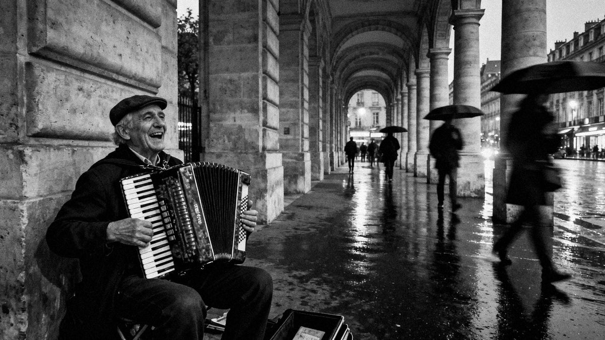
To get a convincing black and white film look in Lightroom, skip the Saturation slider: switch to the Black & White treatment, use the B&W Mix sliders as if they were coloured lens filters, shape contrast with the Tone Curve and finish with grain sized to the film you have in mind. The two classic directions are the open, gritty documentary feel of a 400-speed stock like Ilford HP5 and the graphic, deep-black, fine-grain look of Rollei Retro 80s. Below is a manual recipe for each, plus how to shoot for monochrome in the first place.

Why desaturating looks flat (and how film is different)
Dragging Saturation to -100 throws the colour away and keeps only luminance. The problem is that very different colours often share similar brightness: a red jacket, green leaves and a blue sky can collapse into the same mid grey. The result is a muddy picture with little separation and no direction.
Black and white film never worked that way. Three things gave it character:
- Tonal separation. Each emulsion has its own spectral sensitivity, so it translates colours into greys in its own way. Panchromatic film like HP5 responds across the visible spectrum; a film with extended red sensitivity like Retro 80s renders reds lighter and blues darker.
- Colour filtration. Photographers screwed yellow, orange, red or green filters onto the lens to push certain tones lighter or darker. A red filter turns a blue sky almost black; a yellow filter gives clouds a gentle lift. This is exactly what the B&W Mix panel in Lightroom simulates.
- Grain and curve. Film has a characteristic curve with a soft shoulder and toe, and its grain is part of the image structure rather than noise sitting on top of it.


Two classic looks: HP5 vs Retro 80s
The documentary look of a 400-speed classic (HP5)
Ilford HP5 Plus is a box-speed ISO 400 black and white film, long a favourite of street and press photographers because it is forgiving and flexible. At box speed it gives open shadows, rich midtones and clean but luminous whites, with grain you can clearly see without it taking over. It is also famous for pushing well: rated at 800 or 1600 and developed longer, it gains contrast and grain while the deepest shadows lose some detail. That pushed character, with harder blacks and more bite, is part of the HP5 mythology, so a good simulation should be able to go both ways.
The graphic look of a fine-grain, extended-red film (Retro 80s)
Rollei Retro 80s is a slow film, rated around ISO 80, with sensitivity that extends further into the red than typical panchromatic films. In practice that tends to mean darker blue skies, lighter foliage and skin, and a punchy, contrasty rendering with deep blacks. Its grain is very fine. It suits hard sun, architecture and clean graphic compositions far more than dim interiors.
Manual recipe: HP5-style black and white in Lightroom
These are starting ranges, not fixed values. Every photo reacts differently, so adjust by eye.
- Treatment and profile. Click Black & White in the Basic panel, or pick Adobe Monochrome from the profile browser. Adobe Monochrome tends to give a smoother starting point than the default conversion.
- Basic tone. Contrast around +5 to +15, Highlights around -20 to -40 to hold detail in skies and skin, Shadows around +15 to +30 to keep them open, Whites around +10, Blacks around -5 to -15. The goal is a full scale with air in the shadows.
- B&W Mix as filters. For a mild yellow-filter feel: Yellow around +10 to +20, Orange around +5 to +15 (lifts skin slightly), Blue around -10 to -20 (darkens sky gently). Keep it subtle; HP5 is not a dramatic red-filter film.
- Tone Curve. A soft S curve on the point curve: lift the darkest point slightly (output around 5 to 10) for a print-like black, pull the lower quarter down a touch and raise the upper quarter. In the parametric curve, Lights around +5 and Darks around -5 do a similar job.
- Texture and Clarity. Texture around +5 to +15, Clarity around +5 to +15. Enough to give midtones grit without halos.
- Grain. Amount around 25 to 40, Size around 25 to 35, Roughness around 50 to 70. This is the visible, organic grain of a 400-speed film.
- For a pushed feel. Raise Contrast to around +20 to +30, drop Shadows back toward 0, Blacks around -20 to -30, and Grain Amount to 45 or more with Size around 35 to 45.
Manual recipe: Retro 80s-style black and white in Lightroom
- Treatment and profile. Black & White treatment, Adobe Monochrome or the default profile.
- Basic tone. Contrast around +20 to +35, Highlights around -10 to -20, Shadows around -10 to 0, Whites around +15 to +25, Blacks around -20 to -35. You want solid blacks and bright, crisp highlights.
- B&W Mix to mimic extended red sensitivity. Red around +20 to +35, Orange around +15 to +25, Yellow around +10 to +20, Green around +10 (foliage lighter), Aqua around -20 to -30 and Blue around -30 to -50. This is essentially a red-filter response: skies go dark, skin turns smooth and luminous. Watch for banding in skies if you push Blue too far on a compressed file.
- Tone Curve. A stronger S curve, with the black point anchored at 0 rather than lifted. Retro 80s is about density, not fade.
- Texture and Clarity. Texture around +5 to +10, Clarity around +10 to +20, Dehaze around +5 if the sky needs extra weight.
- Grain. Amount around 10 to 20, Size around 15 to 25, Roughness around 30 to 45. Fine and tight, closer to a texture than a pattern.

HP5 vs Retro 80s at a glance
| HP5-style look | Retro 80s-style look | |
|---|---|---|
| Contrast | Moderate at box speed, harder when pushed | High, graphic |
| Shadows | Open, detailed | Deep, solid blacks |
| Grain | Visible, gritty, organic | Very fine, smooth |
| Skies | Natural grey, gentle separation | Darker, dramatic |
| Skin | Natural, textured | Smooth, luminous |
| Best light | Overcast, indoor, low light, night | Bright sun, hard light, clear skies |
| Best subjects | Street, documentary, candid portraits | Architecture, graphic street, landscapes |
How to shoot for black and white
- Look for light, not colour. Contrast between light and shadow, direction of light and texture carry a monochrome image. A scene that works only because of colour rarely survives conversion.
- Protect your highlights. Expose so bright areas keep detail; you can open shadows later far more cleanly than you can recover clipped whites.
- Shoot raw. Raw files hold the colour information that the B&W Mix sliders need. A JPEG converted in camera has less room to separate tones.
- Think in filters while you frame. Blue sky and white clouds? Plan a Retro 80s-style treatment. Grey day, people and streets? An HP5-style look will feel natural.
- Keep colour off in your head, not your camera. A monochrome preview on the camera screen helps you see tones, while the raw still records full colour.
What the HelloPresets packs add
The recipes above will get you a long way. Where a finished pack helps is consistency and range: a set of variations already tested on different light and subjects, so a whole series of photos holds together without rebuilding the look each time.
The HP5 Plus black and white presets include Standard 1 to 6 for different light and subjects, and Fade 1 to 4 with lifted blacks for a softer, printed feel. The Rollei Retro 80s presets include Standard 1 to 6, Fade, Fade 2, Over-Exposed for bright, high-key frames and Sepia for a warm toned print.
Every pack comes in .xmp for Lightroom Classic, Lightroom desktop and Photoshop Camera Raw, .dng for the free Lightroom mobile app, and .costyle for Capture One. If you want both directions, the Black & White Bundle pairs HP5 and Retro 80s for $29 (€29), one-time payment. If you are new to installing presets, the installation guide covers every app, and our roundup of the best film presets for Lightroom puts these two alongside the colour stocks.
HelloPresets is an independent studio and is not affiliated with Ilford, Harman or Rollei; the film names simply describe the looks our presets are inspired by.
FAQ
How do I make black and white photos look like film in Lightroom?
Use the Black & White treatment instead of desaturating, adjust the B&W Mix sliders to separate tones like a lens filter would, add a gentle S curve, and finish with grain in the Effects panel matched to the film speed you are imitating.
What grain settings look like HP5?
A good starting point is Amount around 25 to 40, Size around 25 to 35 and Roughness around 50 to 70. Push Amount and Size higher for a pushed-film look, and always judge grain at 100% and at your final output size.
How do I darken skies in black and white in Lightroom?
In the B&W Mix, pull Blue and Aqua down and raise Red and Orange slightly. That mimics a red or orange filter. Use a sky mask if the effect starts to darken other blue areas.
Is HP5 or Retro 80s better for portraits?
HP5 suits candid and documentary portraits with natural texture and open shadows. Retro 80s gives smoother, more luminous skin and a graphic feel, which works well for portraits in strong light.
Do black and white film presets work on the Lightroom mobile app?
Yes. The .dng versions install in the free Lightroom mobile app on iPhone, iPad and Android, and include the same B&W conversion and grain settings as the desktop versions.